Nothing gives a web designer more warm fuzzy feelings than when meaningful data is accessible and appealing to those who need it. Except maybe kittens.
Web Design
Information is Beautiful.

Fun project for the "Big Bad" James Frey. The interesting challenge here was to make a desktop site that would scale down nicely without any responsive code. Using the graphic strength of the book covers we were able to pull it off.


Who doesn't love muffins? This site isn't your grandmother's baking blog and the baker and I didn't want it to look like one (although if you're grandmother has a blog, go grandma!). We decided on a bright bold look featuring the baker's real tools. The underlying structure is based on the Quattro theme. Logo design also by yours truly!
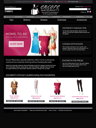
Encore Maternity needed a look that was classy enough to appeal to the high-end shopper but not scare away the bargain hunter. This customized homepage design and development for the second hand ecommerce shop also had to work within the limitations of a Network Solutions online store tool.

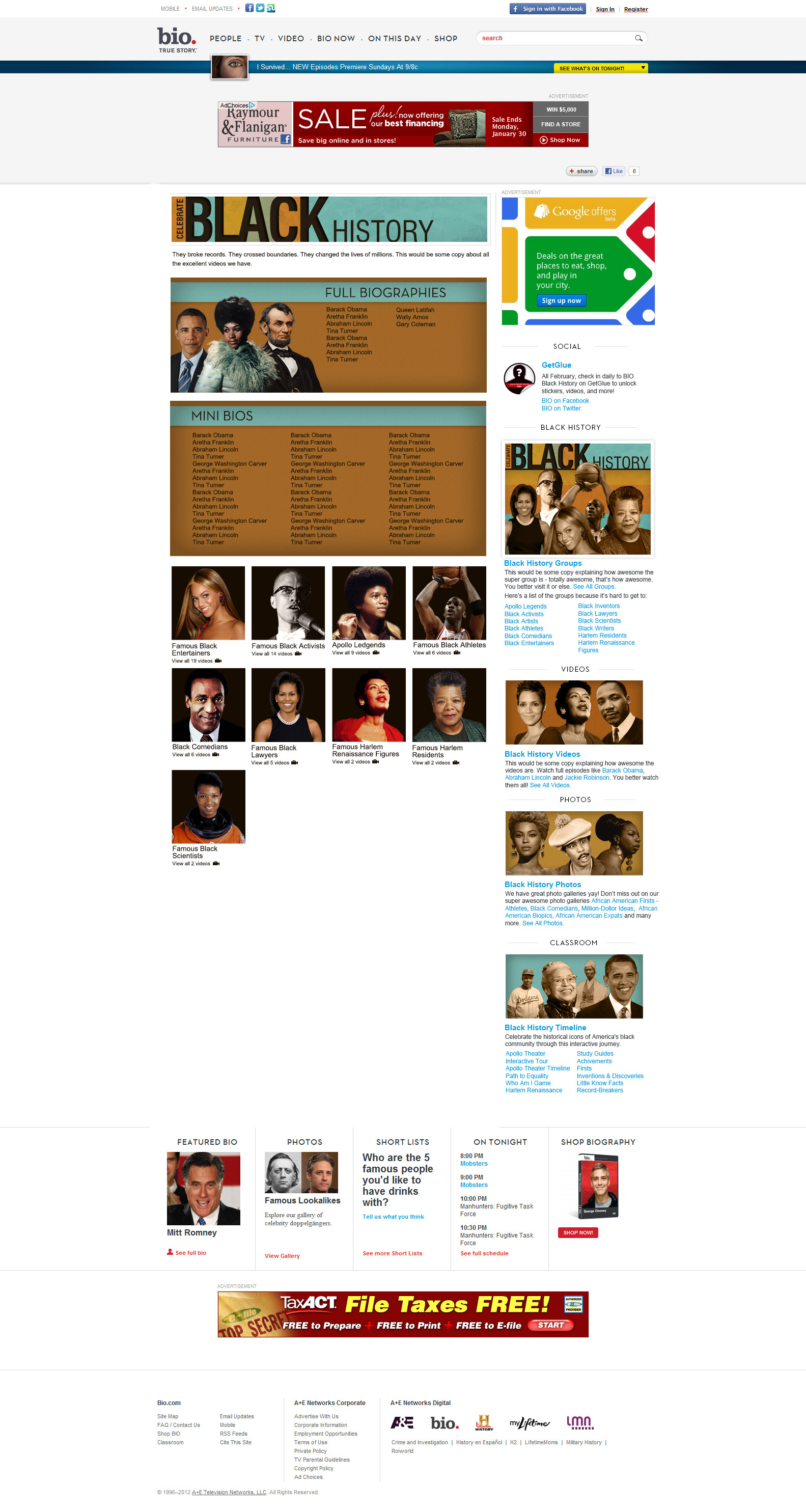
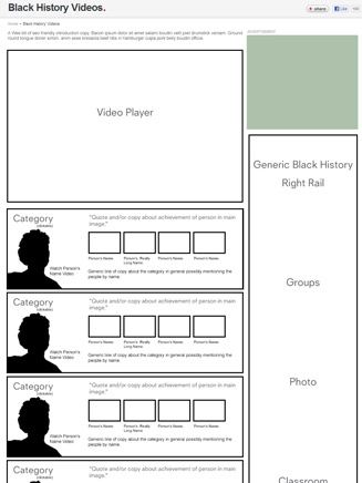
The challenge here was to design and code an engaging and useful list in less than a week. This video portal design & development for Biography.com's most popular section, Black History ended up being such a popular page we rebooted it big time the next year.
Sometimes a traditional wireframe just isn't gonna cut it and when that happens it's nice to have a UI designer who has a bigger tool belt.


It's easy to get caught up in fancy interactions and elegant solutions for things but sometime people just want a clear easy chronological list with some pretty pictures, so that's what we gave them!


Fuse TV needed something a little dark and a lot rad to pull together their Twitter and YouTube pages. Armed with nothing but a handful of logos I made an abstract spacescape that put the Photoshop Warp tool to good use.

One of the most challenging things I do on a regular basis is take assets that don't fit nicely into templates and MAKE THEM. I asked nicely first, or course.

Mission: Cram a ton of information into a little space. Solution: Make an accordion that gives enough information upfront so they are neither frustrated nor overwhelmed.

IDriveYourCar, like many start-ups, needed a web presence that showed they were a reliable and trustworthy company. They needed a little "Ooo pretty" so I designed and built them a site with a fancy slider and expensive vibe.

This is my take on the Twitter Bootstrap genre of design. While I think eventually bootstrap will become 2020's version of Geocites I think it's a great tool for now!

In politics, it's not about who you know it's about who knows you. A simple clean site with your name and picture is exactly what these hopeful politicians needed and what they got.
Web Development
I adore the internet.
The internet and I first met in 1998 on AOL and we hit it off right away. We've been through good times and geocities but from tables to Flash to CSS3 we still have a dear affection for one another.
I'm always trying to learn new languages and keep up with the popular CMSs. I'm solid on front-end skills like HTML and CSS with a splash of Javascript and working on back-end skills like PHP, Python and Ruby. I've worked with all the great CMSs of our day including Wordpress, Drupal, ExpressionEngine, Concrete5, Teamsite, and a whole slew of others. I've even poked around in some child-themeing for Wordpress.
Here are some projects I've worked on.

Baking Adventures in a Messy Kitchen is running on the responsive Quattro theme powered by the Genesis framework but it needed some lovin'. She has a custom child theme that remains responsive through and through, a nice set of custom PHP functions to make her work right and a few custom pages to add sparkle.

The nice part of doing work for family is that you can try out a rad content management system like concrete5. I adapted the Simplicity theme by VivaTemplates to make a super easy to update site my cousin loved.

I wanted to get a little fancy with these buttons so I added a gradual CSS3 animation that desk users would like but no one would miss if they couldn't see it. Check out the codepen to see it in action.

This is a super subtle CSS3 animation I put together to get kids at a career fair excited about web design & development.

The wizards at the Aardvark Brigade did a bang up job designing and developing the fully responsive CAbi site. To maintain what seems like five websites for the price of one we use the LESS CSS parser.

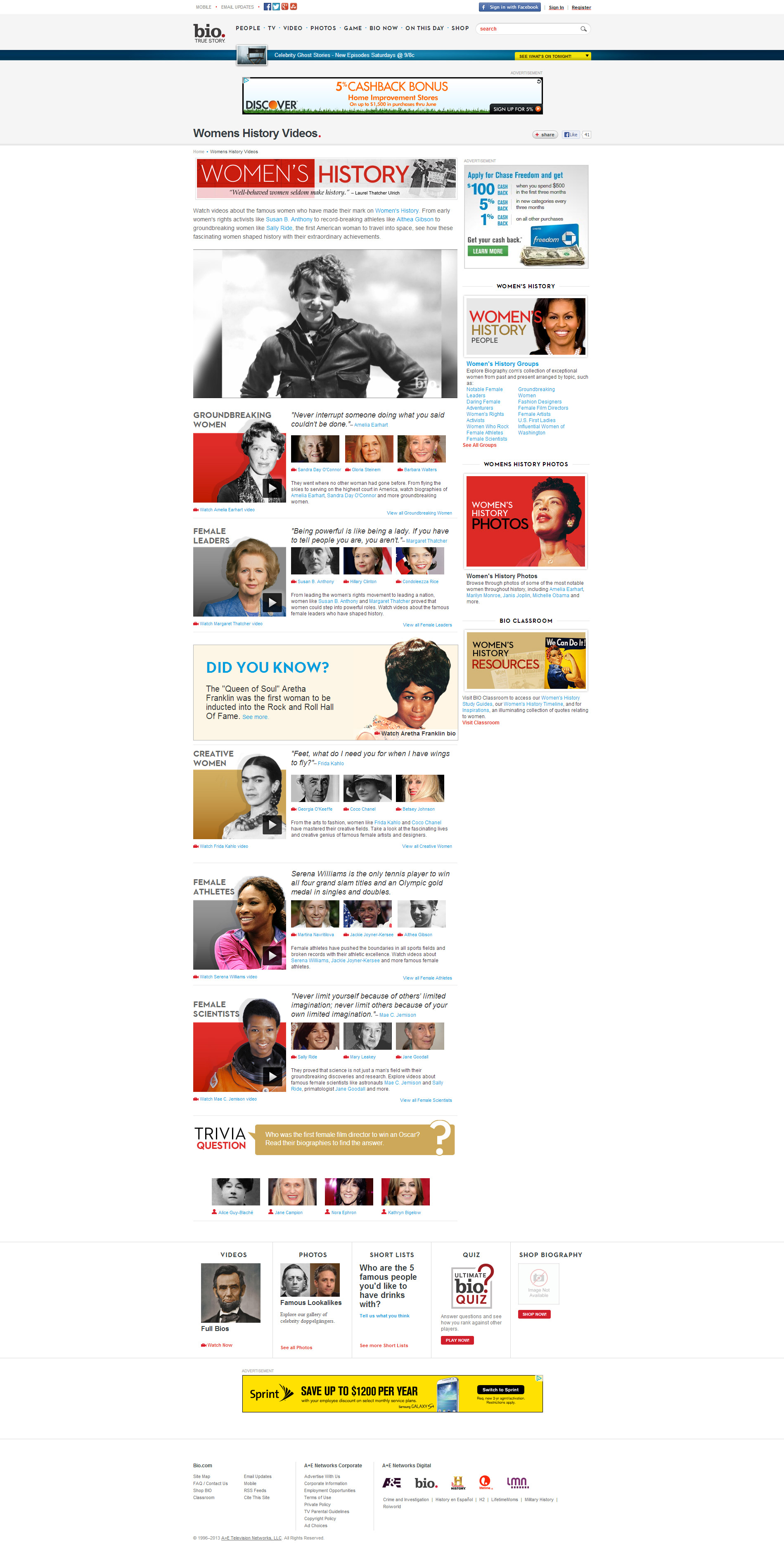
Biogrpahy.com wanted something special for their Women's History & Black History video pages so I came in and made it happen by slipping some slightly tricky css around the teamsite CMS.

A simple design by the geniuses at the Aardvark Brigade deserved an equally simple yet SEO friendly implementation in good ol' HTML with some fancy CSS3 shadows.

Google Maps is one of the best tools on the internet and with just a little bit of Javascript you can make it a little cooler.

Shop Lucky Finds needed a way to brag about all the good press they got so I implemented a quick jquery slider to solve their problem.

Not everyone needs a super fancy custom site – sometimes a slightly altered Wordpress theme is just what the doctor ordered.
Web Production
I do things.
Designers shape the wings and engineers assemble the turbines but someone needs to fly the plane. Seeing how content makers use the sites that designers and developers build for them is extremely valuable.
Here are some examples of things I do everyday.
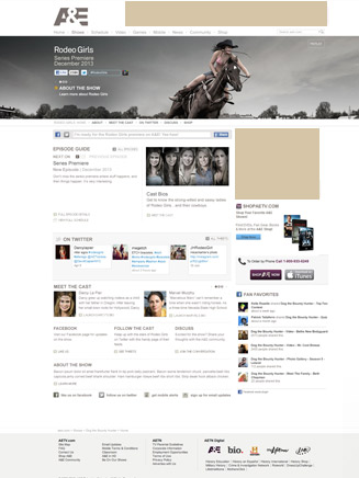
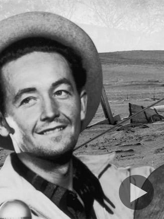
Template site design for Rodeo Girls on AETV.com

A special Black History Month promotion for the Biography.com homepage

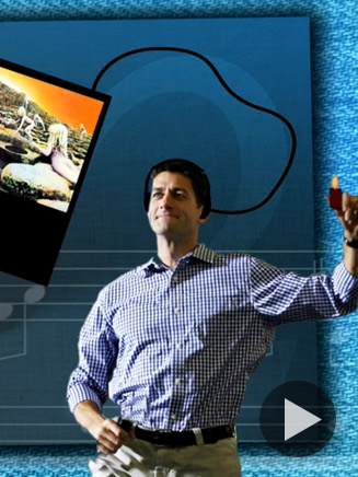
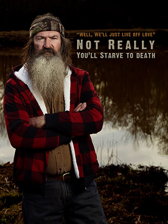
An image made for a show site on Biography.com

A silhouette of Vera Farmington for the A&E Homepage
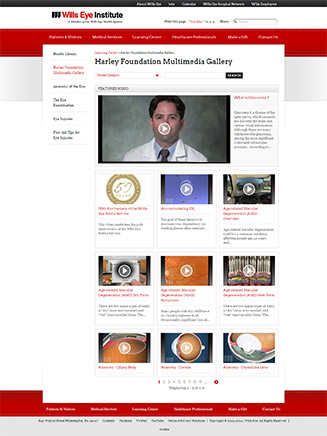
A very full multimedia gallery with hundreds of entries for the exhaustive Wills Eye Hospital site
Mobile
Little Screen. Big Deal.

Biography.com has been tinkering with creating a responsive site so I thought I'd give it a shot. It's an interesting project since there's so much important information.


Designed by the pros at the Aardvark Brigade I added a few thumb friendly pages to their already fancy fingered setup.

Social
Sharing is Caring


Video
Making Moves